Tabor Academy’s Bold New Logo Proves Not Everyone Likes Change
Tabor Academy in Marion is the kind of school where things are slow to change. That's the way alumni and donors tend to like it.
New England Prep Schools such as Tabor value their rich history and are proud of their past. They cherish traditions.
However, that didn't stop Tabor's new administration from making what some are calling a bold move in changing their branding.

The senior leadership team at Tabor says they anticipated pushback from the school community when it considered a change to the logo, but they had their reasons.
"We have had a formal brand and beloved seal since 1918," Director of Strategic Marketing & Communications says Stacy Jagodowski said, "but we were hearing feedback from current students, faculty and staff that our brand was too rigid because of a limited color palette and single-color seal. As a result, instead of aligning with the brand, people were creating their own logos for groups, teams and programs, which resulted in Tabor having dozens of unofficial logos, none of which created a cohesive and recognizable brand."
After sending out two surveys to the Tabor community inviting input and forming committees involving alumni, parents, faculty, staff, trustees and students, the school hired two marketing firms to help create the new-look logo.
"Brand new academic year, brand new us. Introducing our new logo, an addition to our cherished Seal and beloved mascot," the school announced over the holiday weekend.
Head of School Tony Jaccaci said: "Our new logo provides the perfect complement to our traditional seal and our sports logo ‘Sammy the Seawolf.’ We feel this triad of school symbols will best capture the spirit of the Tabor of the past, present, and future."
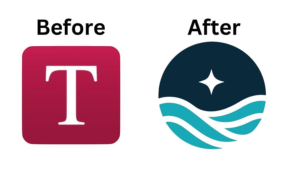
The new Tabor icon featured a change not only to the school's logo, but to the logo's color scheme. "Not everyone relates to sailing; there’s so much more to the meaning behind our tagline of School by the Sea," Jagodowski said.
The new icon includes two new shades of blue with waves and a star that are meant to play up the fact that Tabor is a School by the Sea. (More on the meaning of the new logo is below).
As predicted, not everyone on Tabor's Facebook page welcomed the change with open arms.
One alum wrote, "I had to verify twice it was the same school I went to. The logo looks totally different as if it is a tarot card reading/psychic establishment."
"It’s a yoga studio logo," said Matt Schiff.
Another alum wondered, "What percentage, if any, of alumni donations went to the research and development of this rebrand? Change is good, but this feels tone-deaf."
Some wondered what would happen to the school's athletic uniforms. Jagodowski says the new mark is a school logo and that Tabor's athletic logo remains the Seawolf.
"Prior to this refresh, athletics had its own color palette separate from the school, and now they will use the school’s color palette of Tabor Red, Midnight Blue, and Ocean Blue, with Tabor Red remaining our primary school color. To be cost efficient, we will replace uniforms and update fields in accordance with the regular replacement and maintenance schedules."
Jagodowski stressed that the school is not abandoning any of the symbols that make Tabor special.
"What’s important for our community to remember is that we are not getting rid of anything. We value the history and tradition of this school as much as the rest of our community, and we’re honoring that history. We’re simply adding something new to the mix."

WHAT IS THE MEANING BEHIND THE NEW TABOR ACADEMY LOGO?
According to Jagodowski, the new school logo components are carefully crafted to resonate with Tabor's core values. Here's what the school says about them:
The Ocean: A timeless symbol of challenges and opportunities, the ocean signifies Tabor's unique location and its commitment to nurturing students who rise above challenges. The ocean also connects us to the entire world, a nod to our international community and staying connected to our alumni around the world. It’s also in honor of our waterfront programming, including marine and nautical science, sailing and the iconic SSV Tabor Boy.
The North Star: An unchanging point in the night sky, the North Star is used for navigation and serves as a guiding light, symbolizing the stability and direction that Tabor provides its students. It’s also a nod to the Celestial Navigation course taught here at Tabor.
Colors: Hues of blue evoke the sea and sky, fostering calmness and openness. Tabor Red, a bold touch, underscores the institution's strength. By placing the red on the word TABOR, our school’s color can be present with or without the icon, as the logo was designed to be deconstructed.
Bold Font: The Tabor font is bolder and more distinctive than in previous designs, with clever design elements like the T's flag-like overshoots and the R's wave-like terminal, symbolizing both tradition and progress. The word Tabor is also done in iconic Tabor Red, again, allowing the school color to be featured with or without the icon itself.
QUIZ: Can you identify 50 famous companies by their logos?
Then and Now: Vintage Mattapoisett Pictures After Great 1938 Hurricane
Gallery Credit: Michael Rock
See How School Cafeteria Meals Have Changed Over the Past 100 Years
Gallery Credit: Madison Troyer
More From WFHN-FM/FUN 107